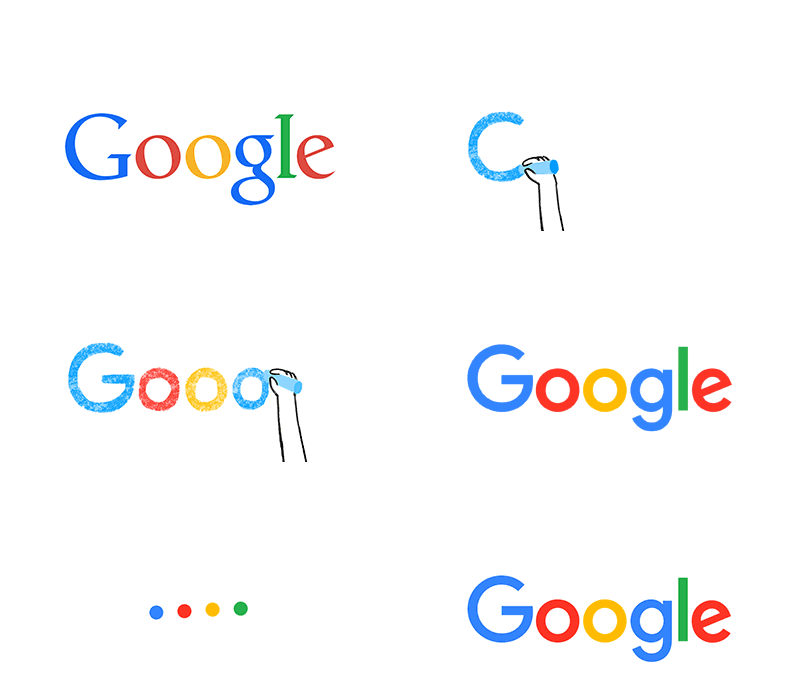
Google is one of those companies that is always growing, billions of people using their products and services every day, most changes have been subtle to maintain user confidence and keep the experience familiar. At the beginning of September they decided to change their logo which has virtually perpetual for the last fifteen years, however recently Google had divided some of it’s projects into a separate conglomerate Alphabet Inc, which is said to now be responsible for various projects such as it’s autonomous cars and Google glass, with each projects having its own CEO. This enables Google to stay focused on its primary and most profitable goals, search.
The new logo also is synonymous with the type face of Alphabet, Google communicates in their blog the change is said to unify the user experience between the different devices people use Google, be it mobile, TV, watches, car dashboards and of course desktop. You might have noticed the lower case ‘g’ has been replaced with a four colour ‘G’ matching their new logo and now universally reflects all method users can interact with Google, such as, tap, type or talk as it transforms itself between the G, coloured dots, equaliser bars and a microphone.


